
-
Text Analysis of Mark Twain’s Speeches
Introduction
The data(A text file of Mark Twain’s Speeches) have been extracted from the open-source https://www.gutenberg.org/. But the actual data which I used is in the Google Drive folder that Austin shared to the class. Note that I did not refine the data as there was no reason for doing so. I used the Voyant tool to analyze the text.
Processes
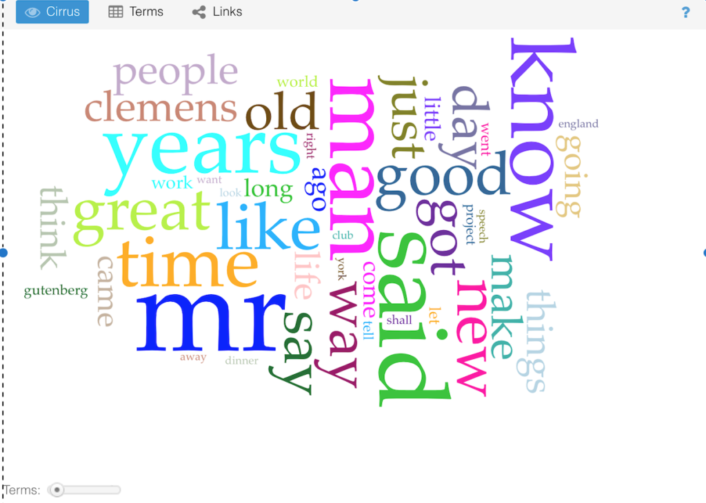
The first parameter I looked at is the word frequencies of the most common words. The first 5 common words are: “mr”, “said”, “years”, “man”, and “know”. One interesting fact I saw was that there are 96 958 words in total but the number of unique word forms is just 8751 which represents only 9% which is very surprising to me. It’s also weird that the average number of words per sentence in a world-renowned author is just 20.
The Voyant tool shows some visuals that make information more digestible to the reader. For example, it can show words that are more frequent to be bigger. Here is an illustration:
There is also a visual which shows more frequent words as bigger circles:

Terms Berry
However, these visuals cannot show how the frequency of a particular word changes across the whole document. To achieve the latter, we need to plot graphs. Luckily, Voyant can do this as well. The figure below shows the variation in frequency of the most common words in the text. It is interesting to note that the x-axis represents the segment of the document.
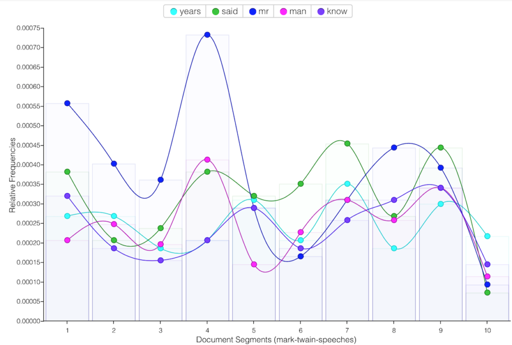
I have found that some words appear predominantly only in one segment of the document. For instance, the word “machinery’s”.

Apart from word frequencies, we can also analyze the links between words:

I am not sure what a link even means in the diagram, but it could be in terms of their relative proximity in the text. For example, I can see that the line joining “years” and “ago” is rather thick which may suggest that the phrase “years ago” appears quite often in the document.
PrESENTATION
The presentation for this DH project is in the form of a Wordpress webpage in a subdomain of my Carleton site. This makes it accessible by anyone at the comfort of their home. Therefore, a very large number of people around the world can see the presentation. Also, one big advantage of using Wordpress is that it is possible to easily add texts and images without writing any code.
significance
The results of this DH project show patterns in Mark Twain’s speeches in one document which alone is not very useful but if, for instance, we compare it with speeches of other writers, we can understand some important things. For example, we could see if there is any link between the word choices of writers and the generation in which they were born. Or we could figure out if there is any link between how popular a writer is and the structure of their writing.